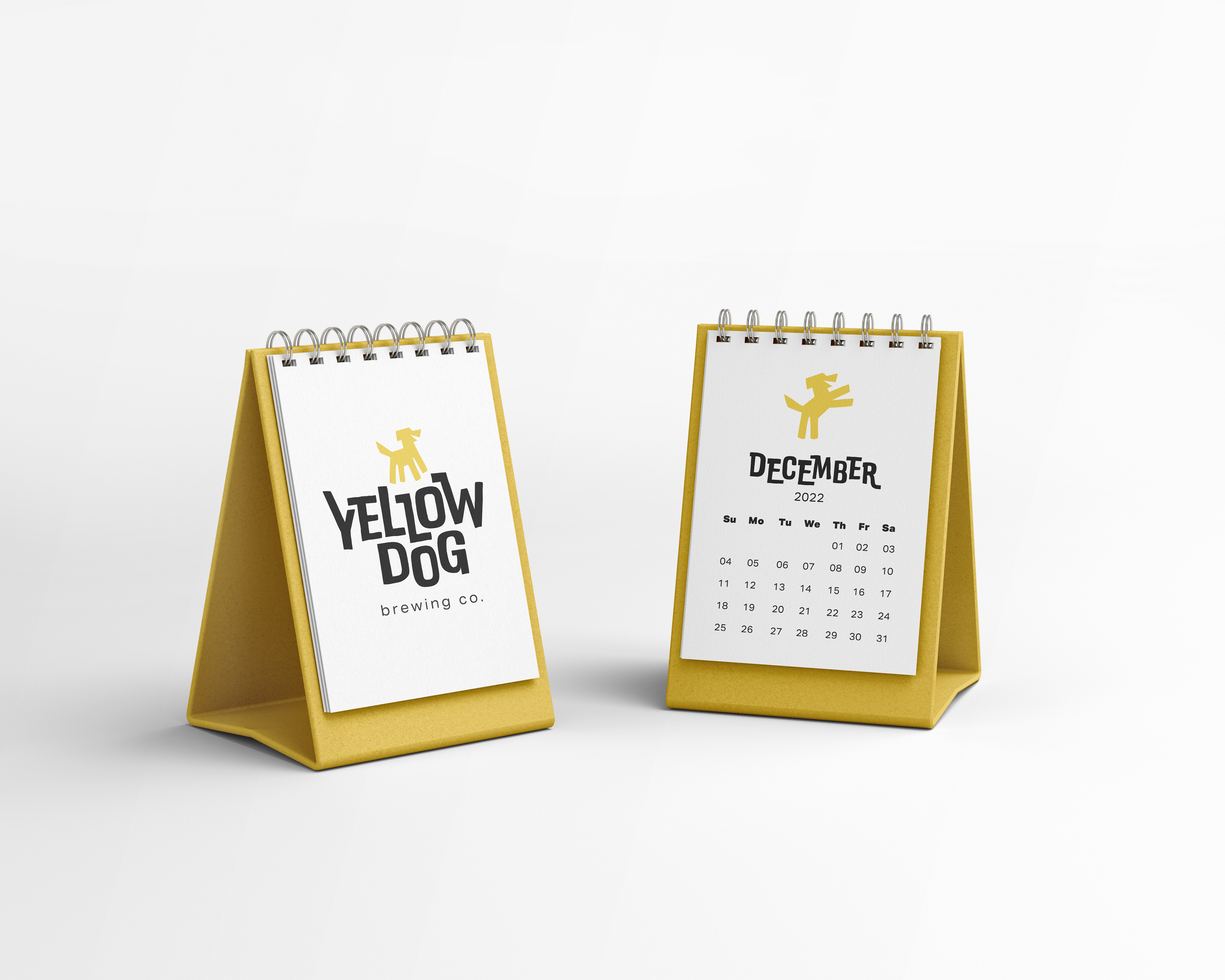
Happiness is a warm puppy and a cold beer.
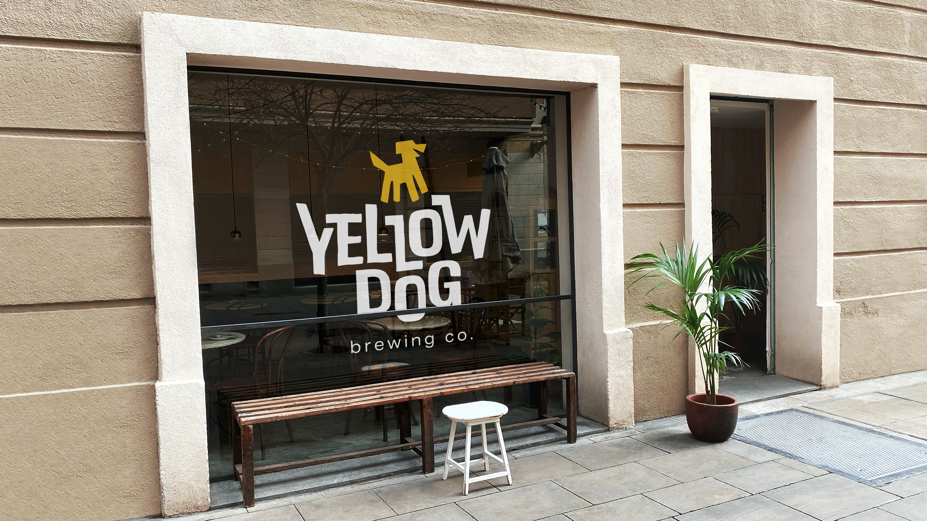
Yellow Dog Brewing is a real brewery located in Port Moody, BC. This is a university project to faux-rebrand their business, tackling the problems that I saw with their current brand.
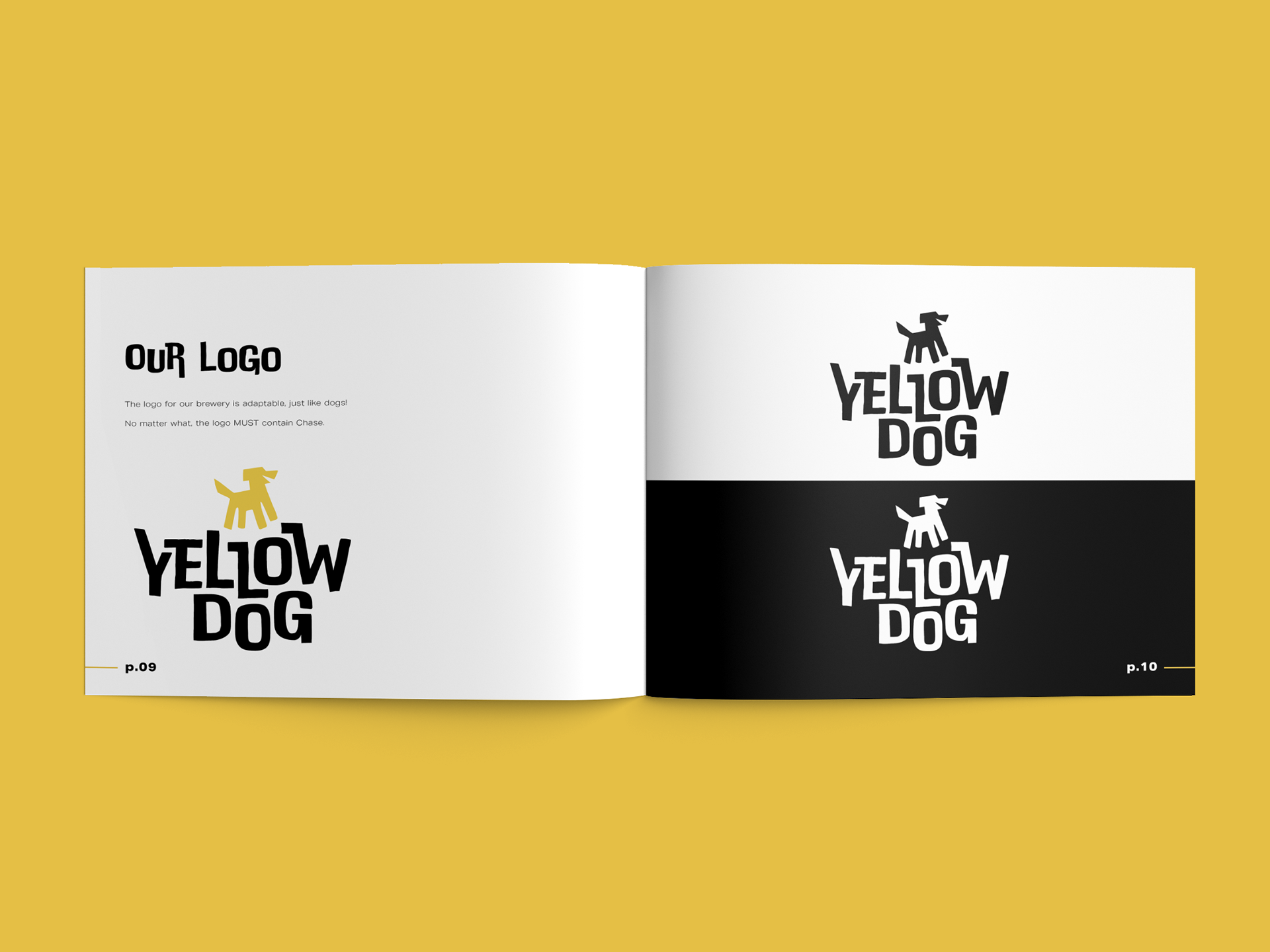
Some of the solutions I sought were to make a more fun, dog-reminiscent brand, to implement a new logo, and to implement a new design system that could be infinitely expanded based on future beers.
Yellow Dog Graphic Standards
Defined pattern usage
Logo and icon breakdown
Typography breakdown
Careful layout design
Defined pattern usage
Logo and icon breakdown
Typography breakdown
Careful layout design
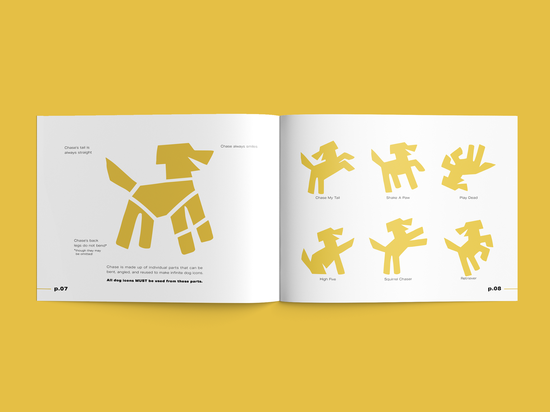
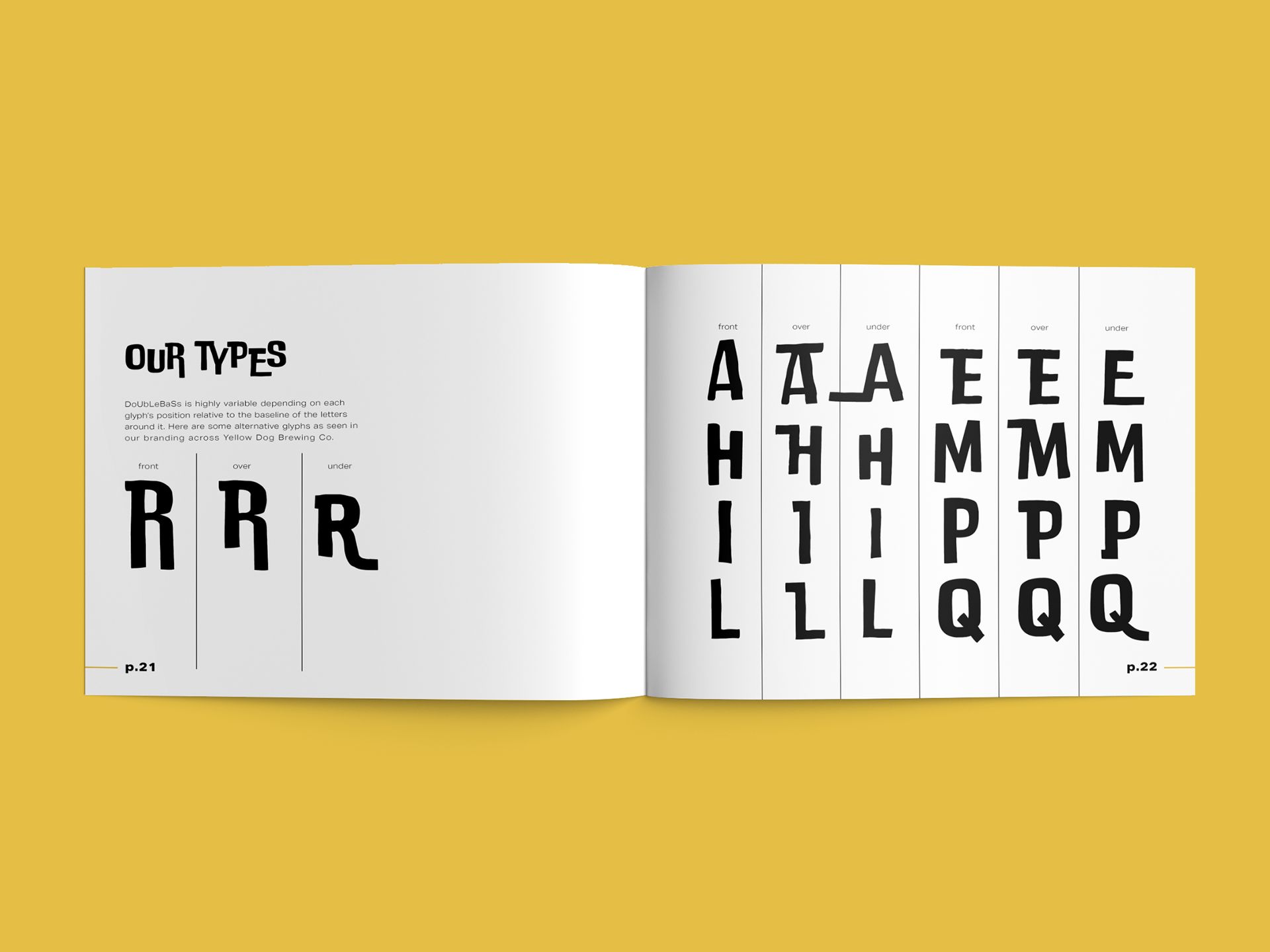
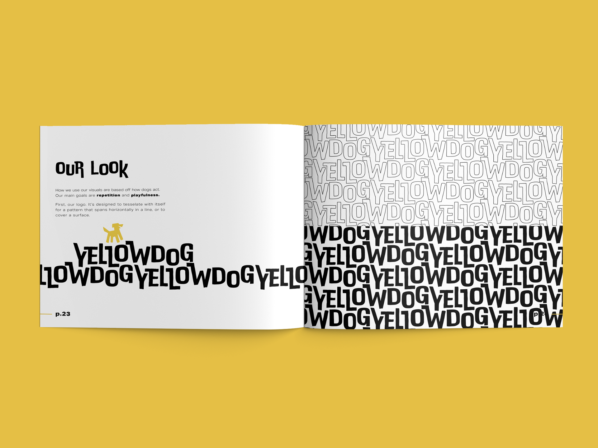
The Graphic Standards Manual for the rebrand of Yellow Dog Brewing outlines each of the uses, rules and restrictions for asset creation, content curation, and overall tone.
Regarding visuals, I felt it was important to have a fun and playful tone to reflect the nature of how people view dogs. I wanted a careful balance between goofy and polished.
Yellow Dog Motion Graphics
Application of GSM rulings
Use of motion graphics to expand on the brand
Use of Adobe After Effects
Application of GSM rulings
Use of motion graphics to expand on the brand
Use of Adobe After Effects
Something that I felt Yellow Dog Brewing lacked was a very bright and poppy animation style. The two animations below outline how that effect is attained, and how it can be used.
Yellow Dog Bottles + Cans
Application of GSM patterns
Use of a visual system to expand on the brand
Use of Adobe Dimension
Application of GSM patterns
Use of a visual system to expand on the brand
Use of Adobe Dimension
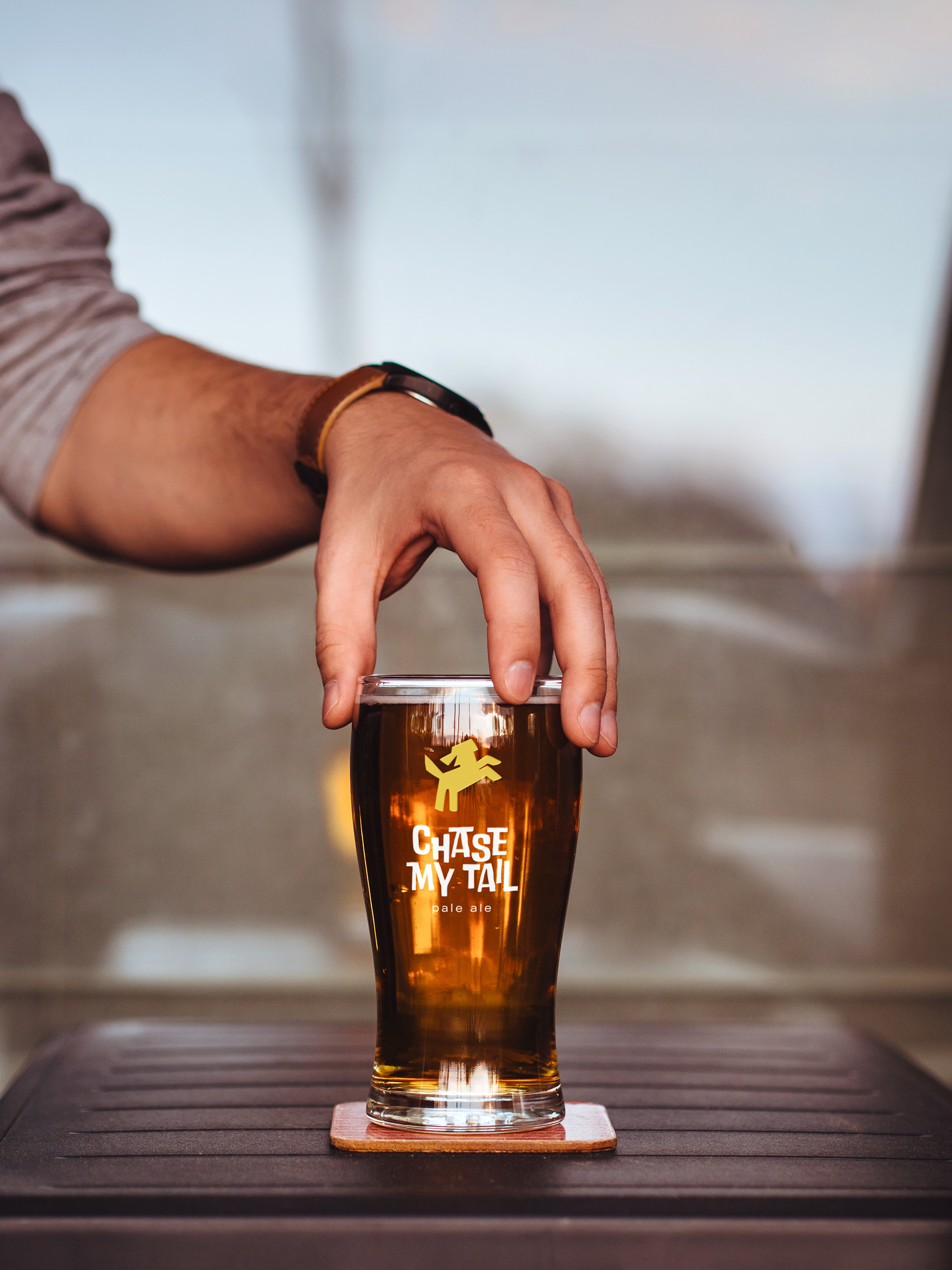
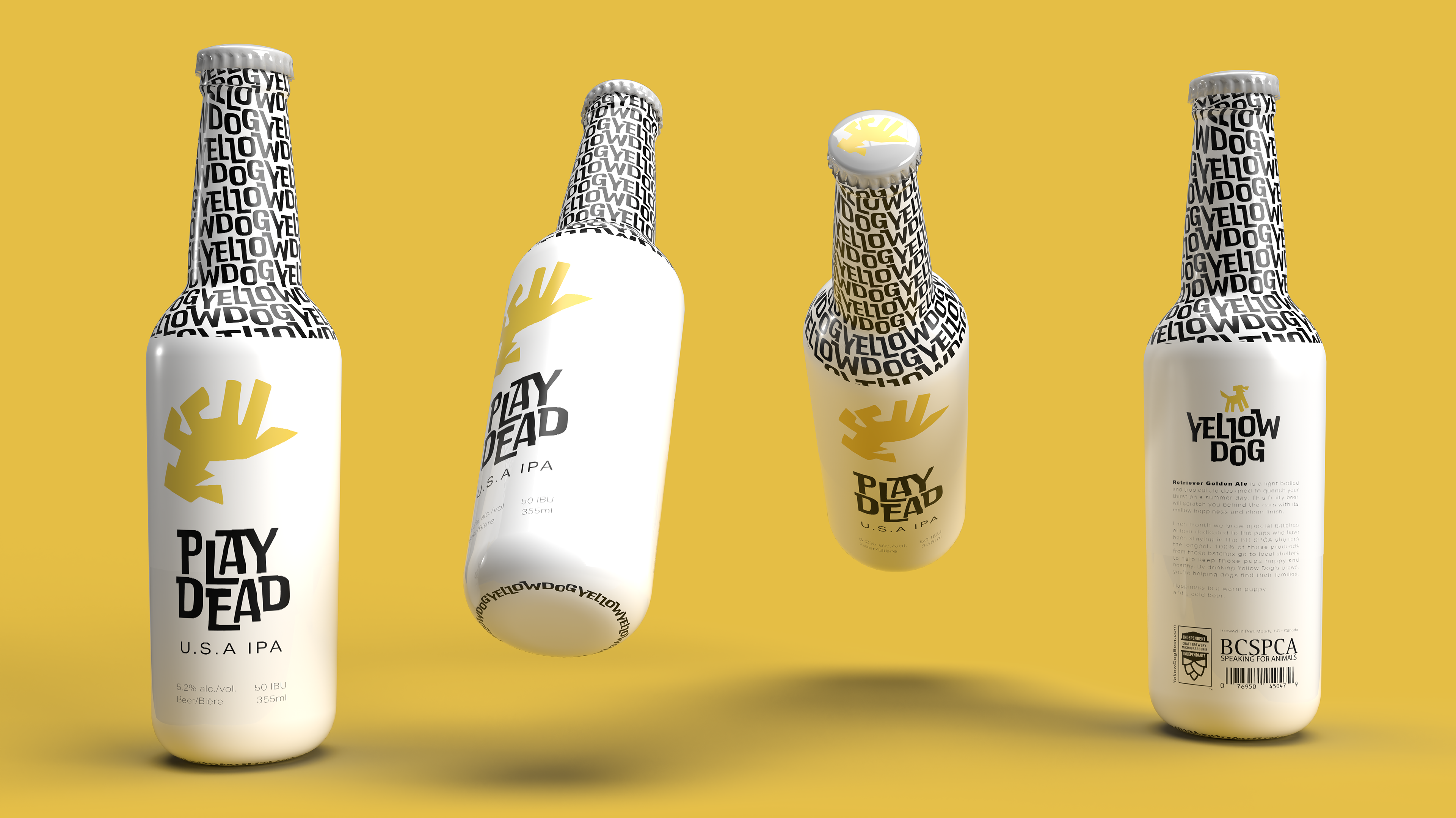
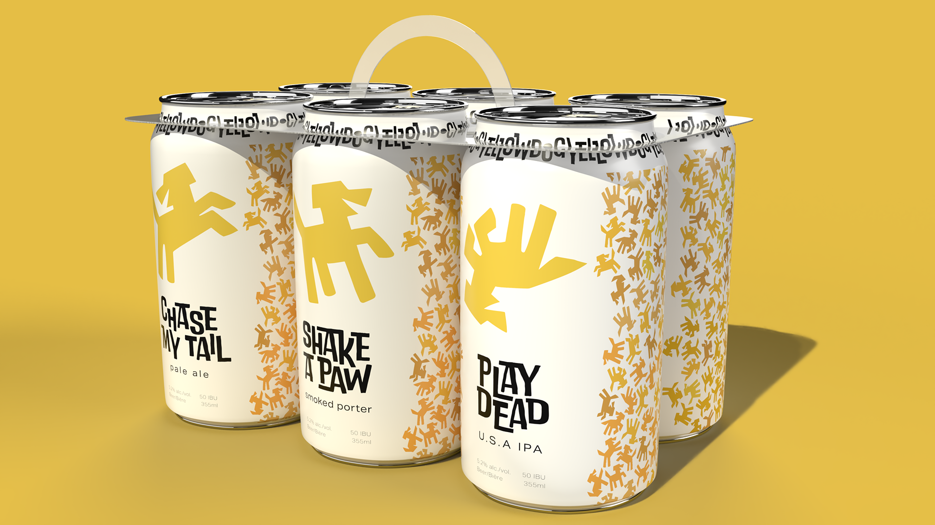
The Yellow Dog Bottles and Cans show off the spunky poppy nature of this rebrand, differentiating each bottle and can by its main icon of our mascot, Chase.
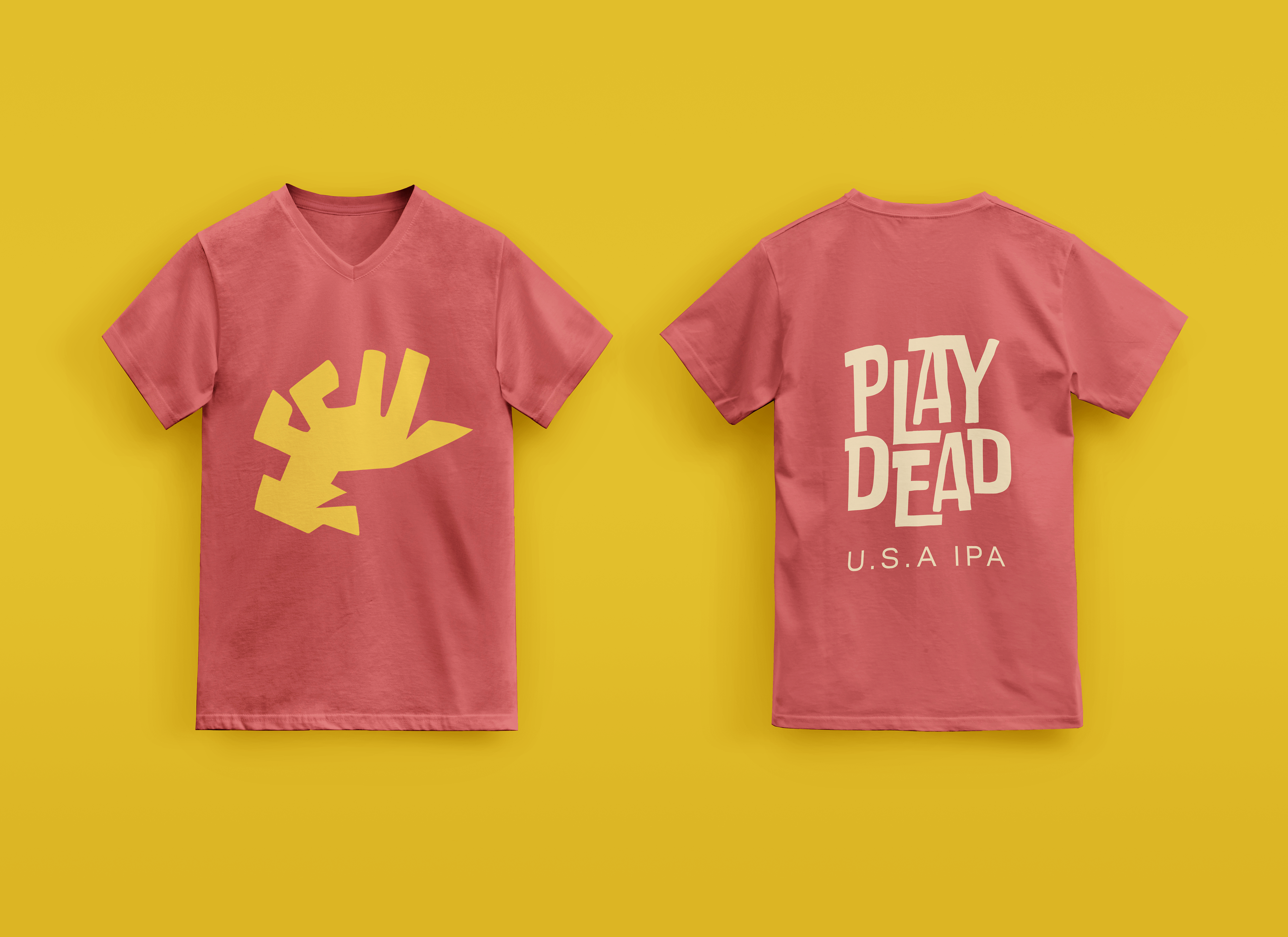
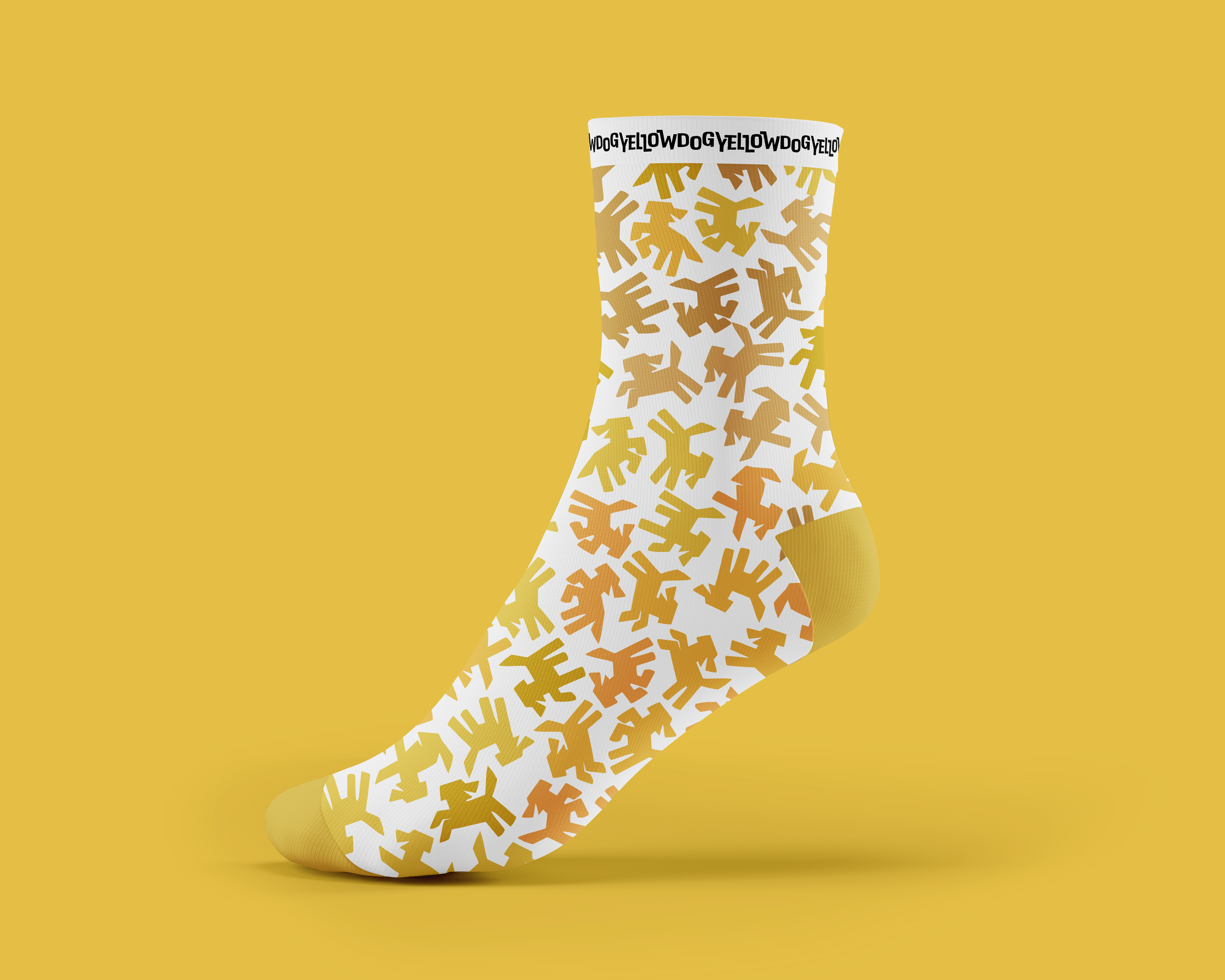
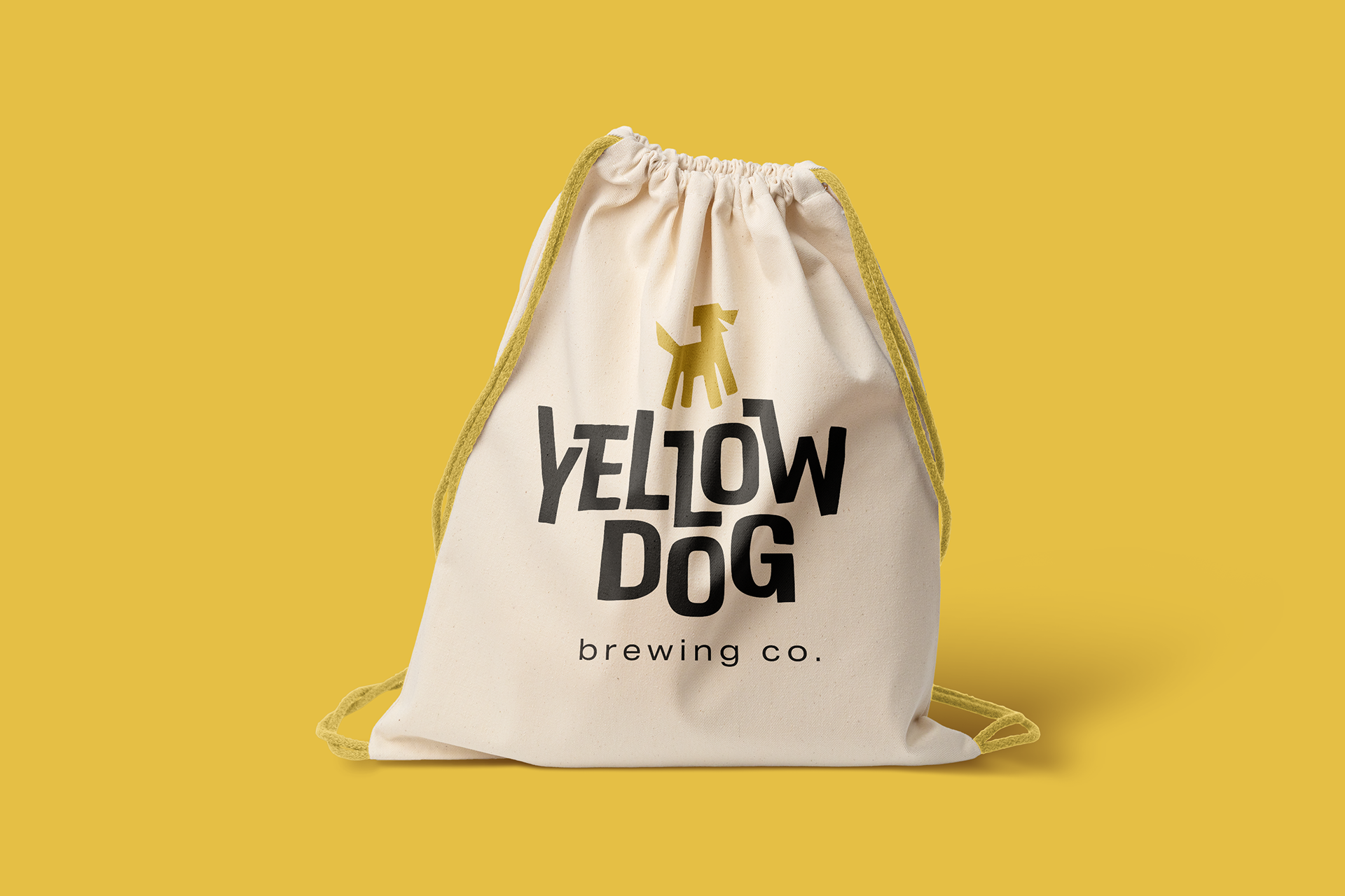
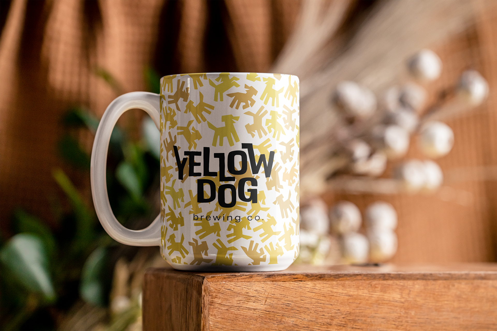
Yellow Dog Concepts + Merch
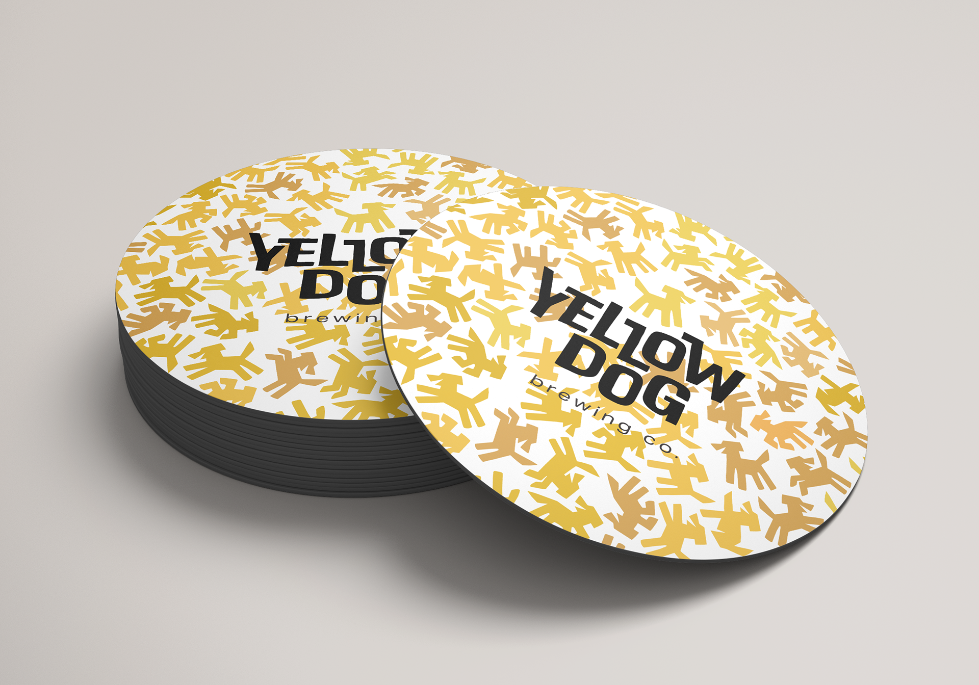
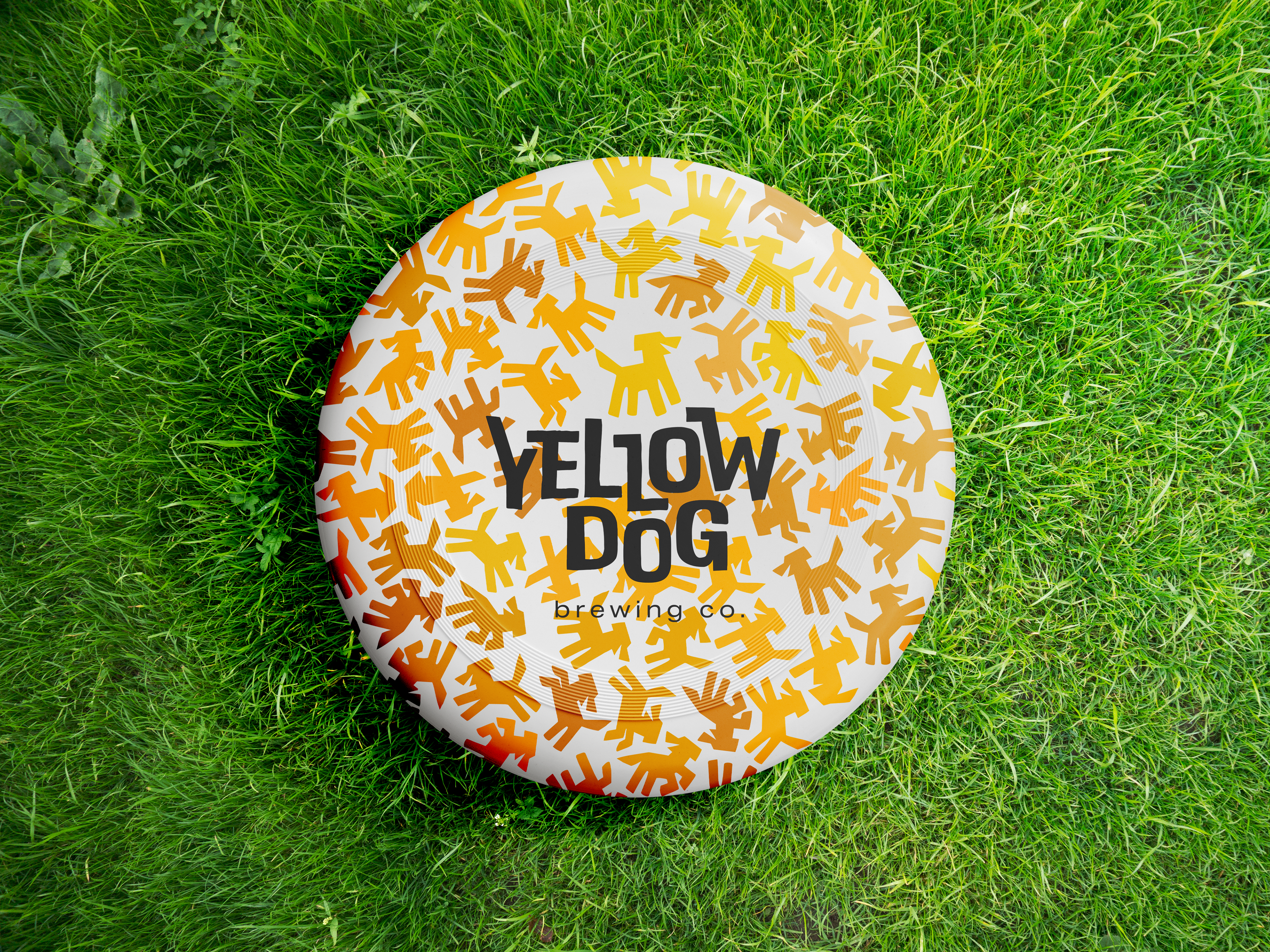
Application of GSM patterns on mockups
Conceptualizing the brand within 3D space
Adobe Illustrator
Adobe Dimension
Adobe Photoshop
Application of GSM patterns on mockups
Conceptualizing the brand within 3D space
Adobe Illustrator
Adobe Dimension
Adobe Photoshop
Visualizing a brand is super fun, and something that I think is very important. It allows people to actually see your work in a real-life setting, rather than imagining how it would work.
The application I'm particularly fond of are the can tabs. During research, I noticed that people really loved Yellow Dog beer, but had trouble remembering the names of each brew. These can tabs are a collectible unit that can pop off and act as magnets on your fridge.
